


Structure
Title: conveys the essence of the project and immediately sets the visual tone—light, warm, and homely.
Charts:
Average number of cups per day
Number per week
Breakdown by day (bar chart)
Text for each graph: explains my ritual, my dependence on morning coffee, and my consumption habits on weekends.
Icons: coffee maker, beans, cup — added as decorative and semantic accents.
The project is executed in A4 infographic format, vertical orientation, created in Adobe Photoshop with a layered PSD file. The main structure consists of a title, three charts, text blocks, author's signature, and visual accents.
Justification for the choice
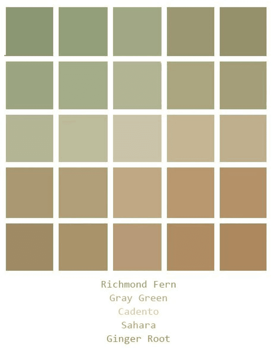 | ColorsThe selected color palette: Richmond Fern, Gray Green, Cadento, Sahara, Ginger Root - warm natural shades that reflect the color of coffee, ceramic cups, wood, and textiles. These colors are not only visually soothing, but also symbolize comfort and the consistency of ritual. They perfectly convey the theme of home, warmth, and daily habits. Everything looks organic and non-aggressive — just as it should be when talking about coffee.Fonts
|
Cell 2-2 | Cell 2-3 |
Style
The style of the project is retro minimalism with illustrative elements. The animated character makes the infographics friendly and the graphics easy to understand. Everything is balanced between emotional and analytical.